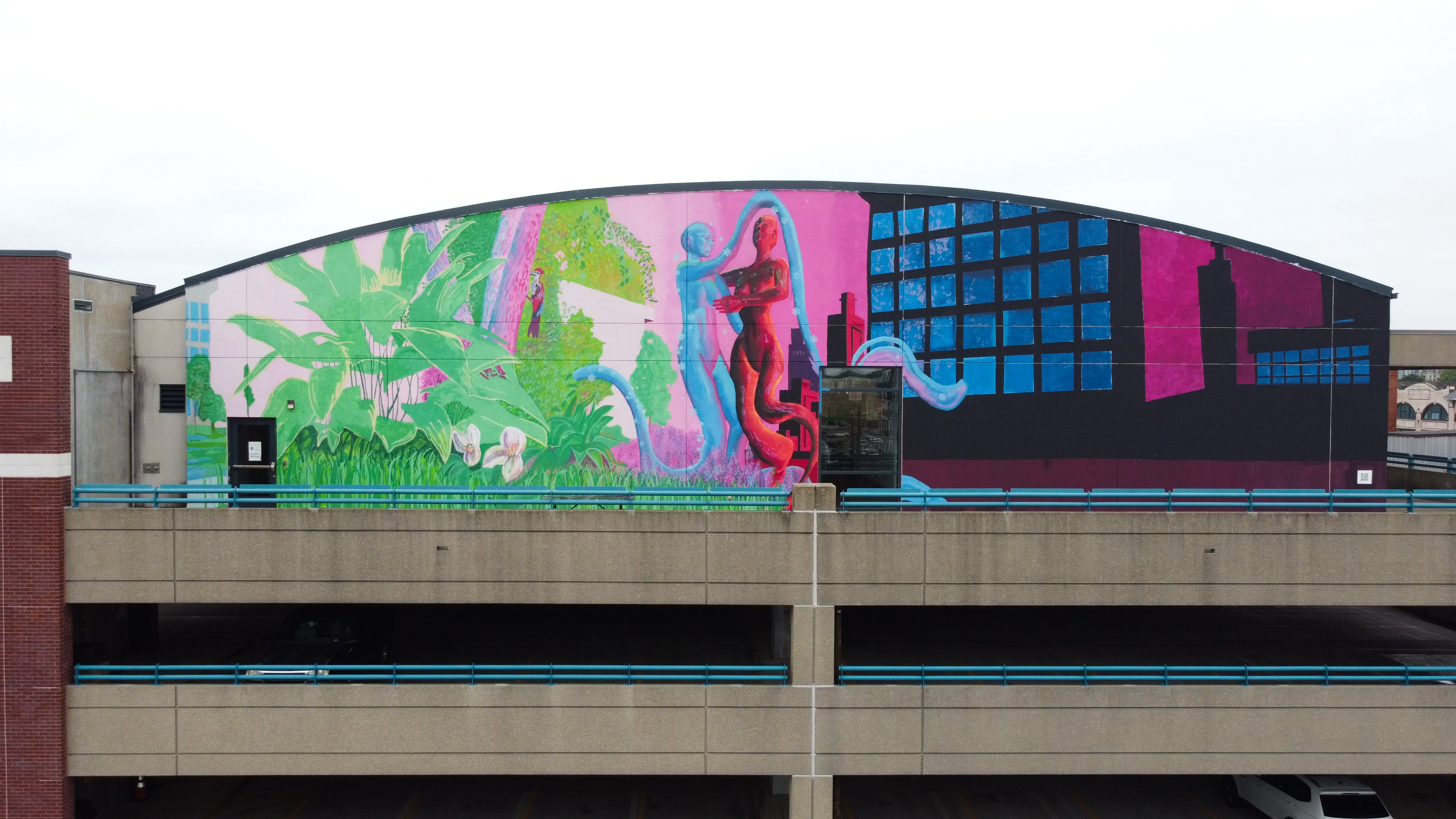
About The Design
I personified two contrasting cities to exemplify the difference between a sustainable city and a city affected by the urban heat island effect. Two figures contrast by color. Their limbs interlock in a pulsing configuration, representing complex and chaotic ecological systems.
The red figure personifies an urban heat island, visibly sweating and in pain from absorbed heat. The surrounding environment of the urban heat island figure displays concrete infrastructure, asphalted roads, and sparse vegetation. The figure’s red paint symbolizes not only heat retention but also the disproportionate heat faced by red-lined neighborhoods in contrast to blue- or green-lined ones.
The blue figure, in contrast, represents a city modeled on sustainability. It is surrounded by forest coverage, wildlife, and infrastructure rooted in garden roofs. The blue figures’ temperature is cooled, symbolizing sustainable urban planning, and their posture is mostly at rest, indicating a harmonious relationship with the environment.